I’ve spent the better part of two weeks redesigning Taiao’s core document to be friendlier for publishing. Here’s what the old document looked like.
I always had a fondness for highlighting my aspects in a bold red, and character attributes in blue. Why? It draws attention. It’s very easy to scan a paragraph of rules and find the task check associated with it. It’s like highlighting the important bits in a module. The aspect or attribute isn’t always the most important part of the text, but more often than not it sits next to it, since they’re only called upon for mechanical functions.
But the PDF is also in landscape. Why?
Why?
Back when I was just making a system to play with, landscape was pretty appealing. My monitor was 1680×1050, cutting down on vertical space a bit more than was usual. I was tired of squinting at huge A4 PDFs in my viewer - you can fit about 2/3rds of them at most on a screen. I understood the reasoning, of course. If you’re making a book, it’s expensive and painful to make a separate layout for a screen. But I was writing my own PDFs now, and eventually I realized that I could orient them any way I wanted.
Landscape offers some peculiar benefits over portrait. Line widths can be wider, so tables can be more complex while occupying less vertical space, and a single page fits more easily on a computer monitor, which are just about always landscape-oriented. Besides, it’s not like it’s unheard of. Yoon-Suin1 did it. And that was enough for me, since none of the drawbacks were relevant at the time.
But as I’ve developed the system out over the years, I got the idea in my head that it’d be nice to have a physical copy of the system around, and that it’d be nice to have something publishable. Turns out those are two things that landscape doesn’t do so well. If you’re not big into printing, the reason is twofold and rather simple. Landscape orientation means less edge to bind, means each page has a looser connection to the spine. Also, landscape books are comparatively awkward to hold.
Fortunately, I’ve learned a lot about my publishing tools since then - and about design in general. So after some experimentation, I came up with a new design - one more refined, and that would better reflect the Renaissance theme that very loosely runs through the default setting of Aia.
The New Book
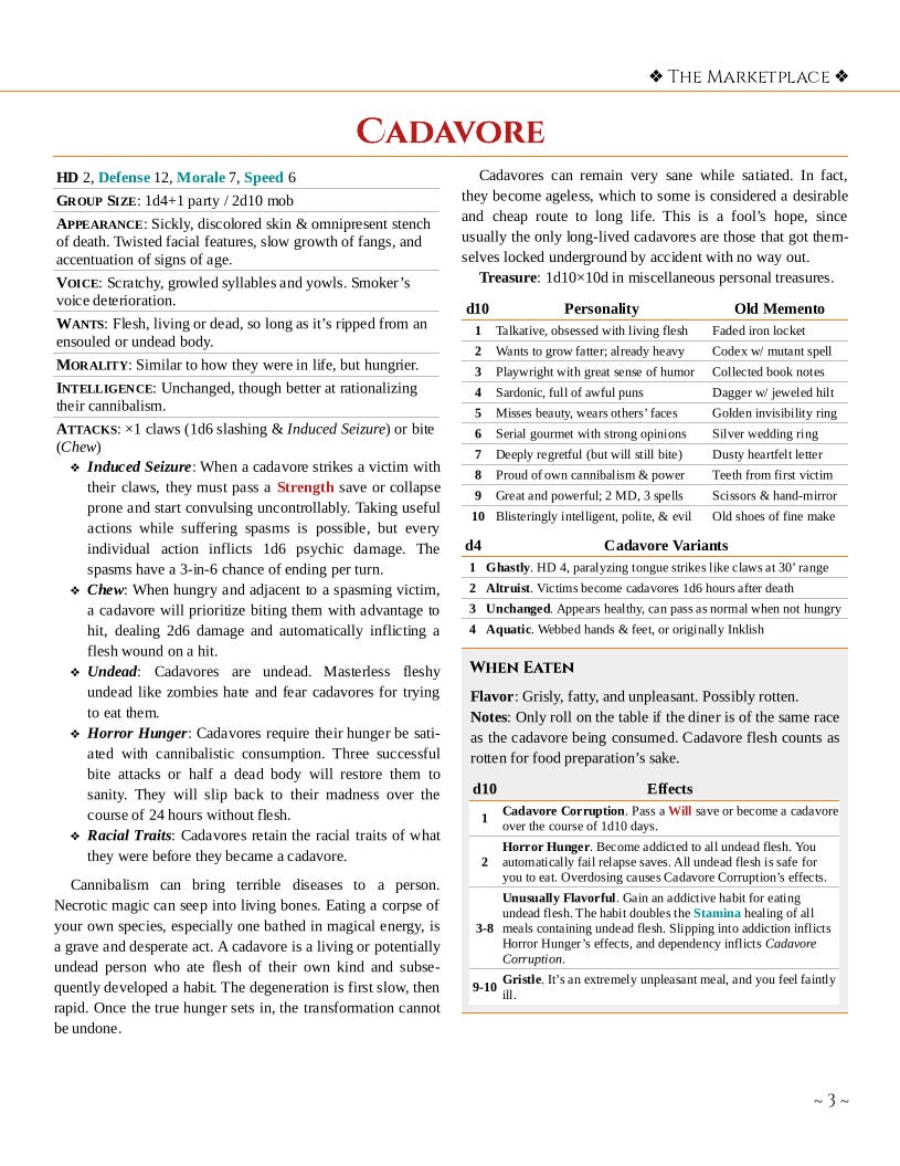
Look carefully, because the following page also counts as the gameable content for this article. (I’ll make a separate Cadavore post later, but it is just a ghoul variant.)

While the earlier PDF’s style was utilitarian (to be generous), this was a style I explicitly prepared as a final design. I wanted something good enough for a published product, not just a draft. Since I was starting to plan out artwork ratios, I needed to radically reorient the entire document. And since I was preparing a product for print … landscape had to go. So long as the core rules remained as a landscape document, no planning could be done since the ratio of everything - the columns, the space the text occupies - is different. So I swapped it all to portrait.
Turns out that’s really painful. You’ll note I swapped to a serif font; it’s tighter, but all the measurements are different. Every single page got a bit longer or shorter when I initially updated the style, and suddenly all those carefully laid-out landscape tables were thrown out of proportion. It took a lot of effort, coercion, and extremely tight editing to make most of them fit in the portrait page that had once held them fine in landscape. Worse was the shrinking margins; while the landscape PDF had been designed with tight margins as it was only to be viewed on a monitor, when you’re designing for a book you have to account for both the gutter and how someone will actually grip the page. All of that eats up valuable real estate.2
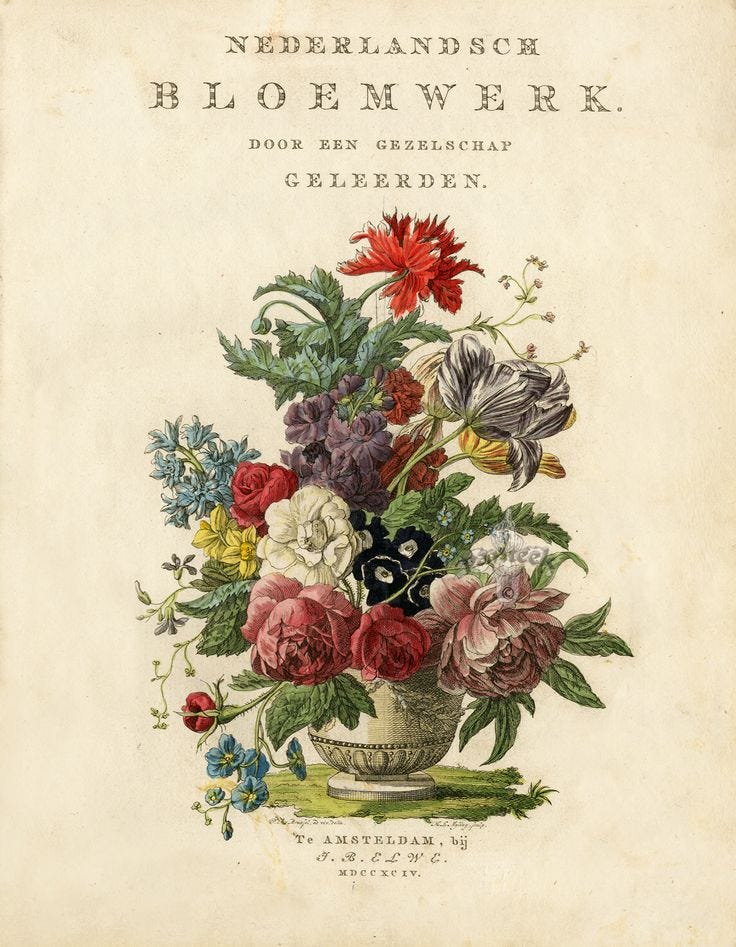
I was (and still am) fairly proud of this design, but the problem I encountered with it was that it just didn’t work with the kind of art that I could produce for it. Though I had imagined a style similar to botanical sketches or watercolors would be nice to pair with it, in practice it turned out that my lack of experience in both made it difficult to supply the art myself, and commissioning for a project as large as two game books is outside both my means and interest.

So, a few weeks ago, I opened up the rework document and redid it all again.
The New New Book

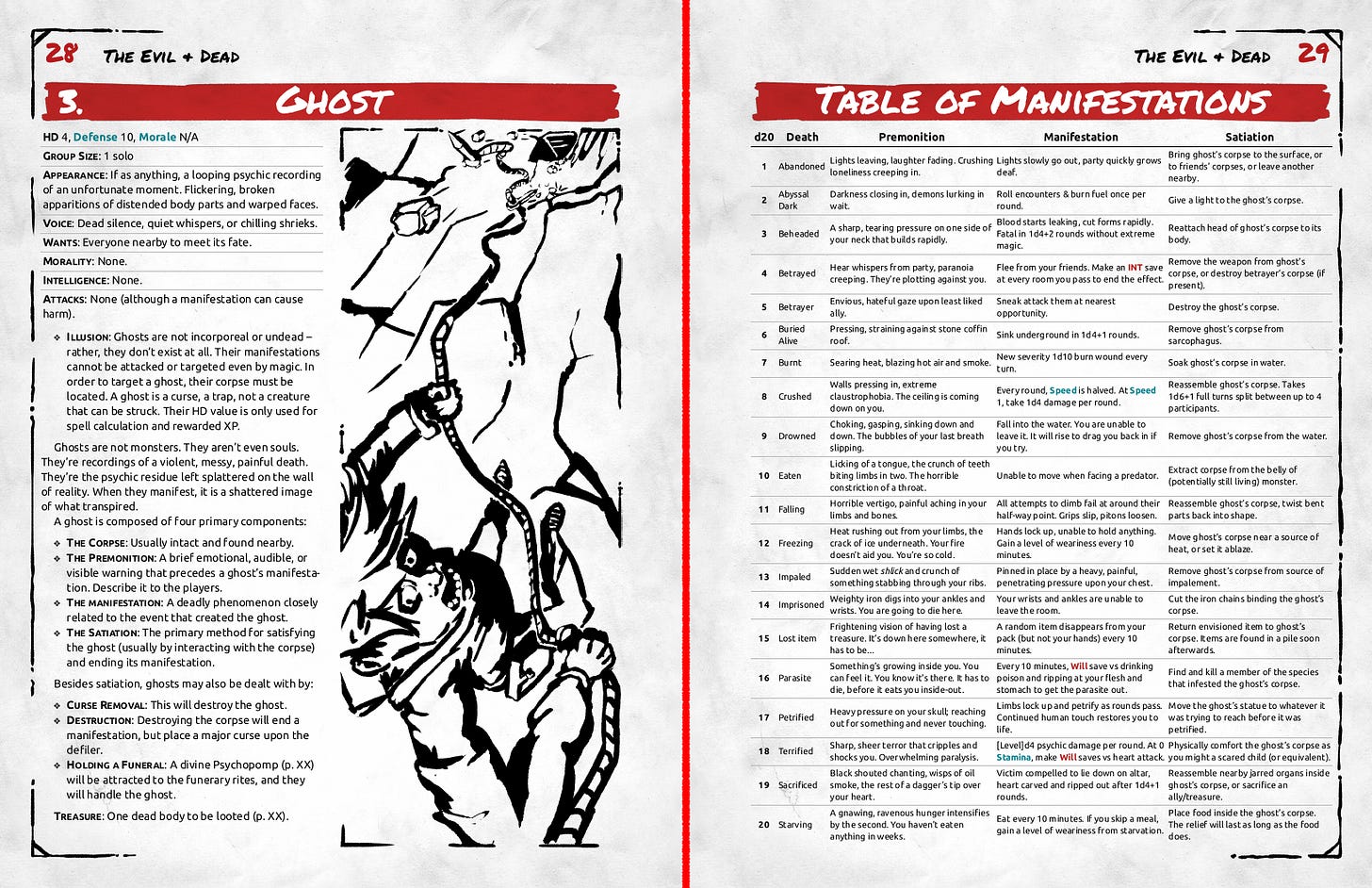
So this came about when I was splattering some ink on a canvas trying to figure out the cheapest way to make a sketch look good. A comic style that’s cheap and quick to draw, one that’s fun rather than a chore. I may be slowly preparing Taiao for a professional publication, but I’m not about to let what is fundamentally a labor of love become an unprofitable hassle over some artwork. I mean, more unprofitable than it already likely is.
The Ghost - as covered in Ghosts, Expanded - ended up being the first piece of artwork, mostly by coincidence. I happened to be thinking about it at the time, of course. At this time, I was still looking at the previous iteration’s layout, so the heavy inked artwork didn’t look right sitting atop the book as it existed. Rich layout, thin gold lines, and a big splatter of black ruining the view. Yeah, right. But I was so in love with it that I went and stripped the entire book style down to its bones and rebuilt it anew to match the image I had made.
Along the way, I took the time to patch up and fix a bunch of the book’s other flaws. A new polished encumbrance system, an entirely new magical school, a clearer character creation chapter and some tweaks to bring the system more in-line with other OSR titles. I also brought the ability score/modifier back after a long period of experimenting with just keeping the modifier around. Obviously enough, they have their uses after all.3 I suppose I’ve just had enough of being an iconoclast.
I was later told that the new art direction rather resembles Index Card RPG, which I found to be rather amusing. I wonder if it’s a case of convergent evolution and similar priorities? But I can only speculate.
Tell me what you think, what you’d like to hear more about. Like and subscribe if you haven’t! And check out the old ugly Taiao PDF on the website before I replace it with the new pretty one, and get some spoilers on future blog posts while you’re at it.
The good news was that the slimmed-down design with bigger margins let more of the paper be readable on a screen despite the portrait orientation. I am still designing for screen use, here - it’s the only place I can run a game from until this hypothetical book is hypothetically in print.
That could occupy a whole article by itself, honestly, but I suspect it’d be a rather dry one.


